Principal Component Analysis (PCA) 101
This is the first entry in what will become an ongoing series on principal component analysis (PCA) in Excel. In this tutorial, we will start with the general definition, motivation, and applications of a PCA, and then use NumXL to carry on such analysis. Next, we will closely examine the different output elements in an attempt to develop a solid understanding of PCA, which will pave the way to more advanced treatment in future issues.
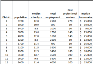
In this tutorial, we will use the socioeconomic data provided by Harman (1976). The five variables represent the total population (“Population”), median school years (“School”), total employment (“Employment”), miscellaneous professional services (“Services”), and median house value (“House Value”). Each observation represents one of twelve census tracts in the Los Angeles Standard Metropolitan Statistical Area.
Data Preparation
First, let’s organize our input data. First, we place the values of each variable in a separate column and each observation (i.e., census tract in LA) in a separate row.
Note that the scales (i.e., magnitude) of the variables vary significantly, so any analysis of raw data will be biased toward the variables with a larger scale, and downplay the effect of ones with a lower scale.
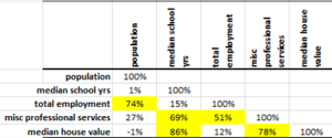
To better understand the problem, let’s compute the correlation matrix for the 5 variables:
The five (5) variables are highly correlated, so one may wonder:
- If we were to use those variables to predict another variable, do we need the 5 variables?
- Are there hidden forces (drivers or other factors) that move those 5 variables?
In practice, we often encounter correlated data series: commodity prices in different locations, future prices for different contracts, stock prices, interest rates, etc.
In plain English, what is principal component analysis (PCA) in Excel?
PCA is a technique that takes a set of correlated variables and linearly transforms those variables into a set of uncorrelated factors.
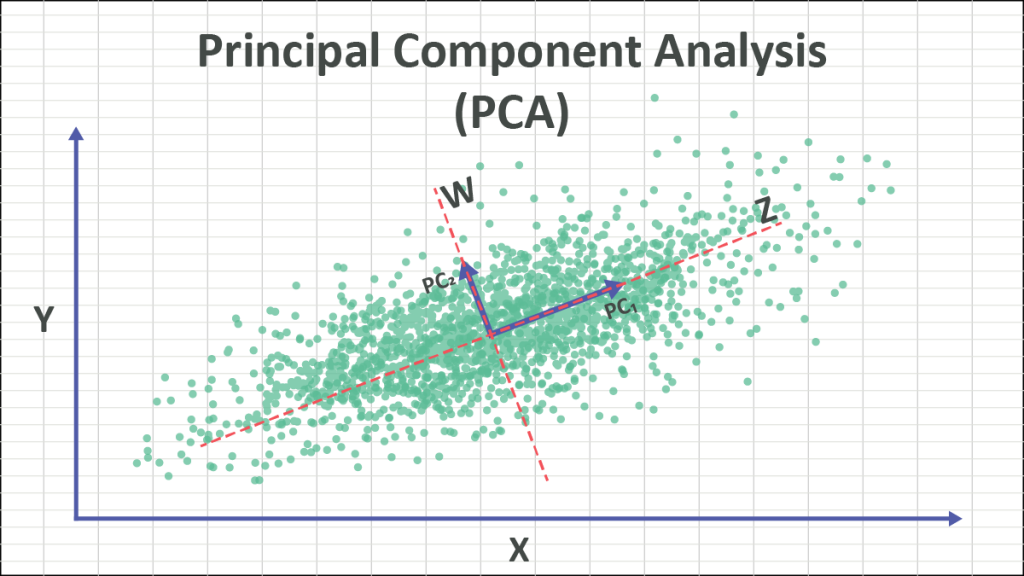
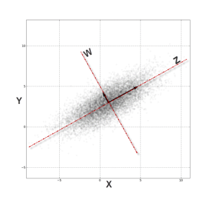
To explain it further, you can think about PCA as an axis-system transformation. Let’s examine this plot of two correlated variables:
Simply put, from the (X, Y) Cartesian system, the data points are highly correlated. By transforming (rotating) the axis into (Z, W), the data points are no longer correlated.
In theory, the PCA finds that those transformations (of the axis) of data points will look uncorrelated with their respect.
OK, now where are the principal components?
To transform the data points from the (X, Y) Cartesian system to (Z, W), we need to compute the z and w values of each data point:
$$z_i=\alpha_1 x_i + \beta_1 y_i$$ $$w_i=\alpha_2 x_i + \beta_2 y_i$$
In effect, we are replacing the input variables ($x_i,y_i$) with those of ($z_i,w_i$).
These ($z_i,w_i$) values are the ones we refer to as the principal components.
Alright, how do we reduce the dimensions of the variables?
When we transform the values of the data points ($x_i,y_i$) into the new axis system ($z_i,w_i$), we may find that a few axes capture more of the values’ variation than others. For instance, in our example above, we may claim that all $w_i$ values are plain zero and don’t really matter.
$$ \left.\begin{matrix} x_i=\gamma_1 z_i + \phi_1 y_i \\\\ y_i=\gamma_2 z_i +
\phi_2 y_i \end{matrix}\right\} \Rightarrow \left.\begin{matrix} x_i=\gamma_1
z_i \\\\ y_i=\gamma_2 z_i \end{matrix}\right\} $$
In effect, the two-dimensional system ($z_i,w_i$) is reduced to a one-dimensional system ($z_i$).
Of course, for this example, dropping the $W$ factor distorts our data, but for higher dimensions, it may not be so bad.
Which component should we drop?
In practice, we order the components (aka factors) in terms of their variance (highest first) and examine the effect of removing the ones of lower variance (rightmost) in an effort to reduce the dimension of the data set with minimal loss of information.
Why should we care about principal components?
A risk manager can quantify their overall risk in terms of a portfolio aggregate exposure to a handful of drivers, instead of tens of hundreds of correlated securities prices. Furthermore, designing an effective hedging strategy is vastly simplified.
For traders, quantifying trades in terms of their sensitivities (e.g., delta, gamma, etc.) to those drivers gives traders the option to substitute (or trade) one security for another, construct a trading strategy, hedge, synthesize security, etc.
A data modeler can reduce the number of input variables with minimal loss of information.
Process
Now we are ready to conduct our principal component analysis in Excel. First, select an empty cell in your worksheet where you wish the output to be generated, then locate and click on the “PCA” icon in the NumXL tab (or toolbar).
The principal component analysis Wizard pops up.
Select the cells to range for the five input variable values.
- The cell range includes (optional) the heading (“Label”) cell, which would be used in the output tables where it references those variables.
- The input variables (i.e., X) are already grouped by columns (each column represents a variable), so we don’t need to change that.
- Leave the “Variable Mask” field blank for now. We will revisit this field in later entries.
- By default, the output cell range is set to the currently selected cell in your worksheet.
Finally, once we select the Input data (X) cells range, the “Options” and “Missing Values” tabs become available (enabled).
Next, select the “Options” tab.
Initially, the tab is set to the following values:
- “Standardize Input” is checked. This option in effect replaces the values of each variable with its standardized version (i.e., subtract the mean and divide by standard deviation). This option overcomes the bias issue when the values of the input variables have different magnitude scales. Leave this option checked.
- “Principal Component Output” is checked. This option instructs the wizard to generate PCA-related tables. Leave it checked.
- Under “Principal Component,” check the “Values” option to display the values for each principal component.
- The significance level (aka \alpha) is set to 5%.
- The “Input Variables” is unchecked. Leave it unchecked for now.
Now, click on the “Missing Values” tab.
In this tab, you can select an approach to handle missing values in the data set (X’s). By default, any missing value found in any of the input variables (X) in any observation would exclude the observation from the analysis.
This treatment is a good approach for our analysis, so let’s leave it unchanged.
Now, click “OK” to generate the output tables.
Analysis
1. PCA statistics
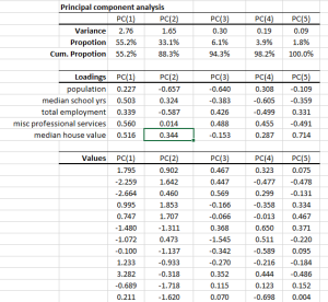
- The principal components are ordered (and named) according to their variance in descending order, i.e., PC(1) has the highest variance.
- In the second row, the proportion statistics explain the percentage of variation in the original data set (5 variables combined) that each principal component captures or accounts for.
- The cumulative proportion is a measure of total variation explained by the principal components up to this current component.
Note: In our example, the first three PC accounts for 94.3% of the variation of the 5 variables. - Note: that the sum of variances of the PC should yield the number of input variables, which in this case is five (5).
2. Loadings
In the loading table, we outline the weights of a linear transformation from the input variable (standardized) coordinate system to the principal components.
For example, the linear transformation for $PC_1$ is expressed as follows:
$$PC_1=0.27X_1+0.503X_2+0.339X_3+0.56X_4+0.516X_5$$
Note:
- The squared loadings (column) add up to one.
$$\sum_{i=1}^5 \beta_i^2 = 1$$
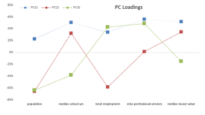
- In the graph above, we plotted the loadings for our input variables in the first three components.
- The median school years, misc. professional services and median house value variables have comparable loadings in PC(1), next comes total employment loading, and finally, population. One may propose this as a proxy for the wealth/income factor.
- Interpreting the loadings for the input variables in the remaining components prove to be more difficult and requires a deeper level of domain expertise.
- Finally, computing the input variables back from the PC can be easily done by applying the weights in the row instead of the column. For example, the population factor is expressed as follows:
$$X_1=0.227 PC_1-0.657PC_2-0.64PC_3+0.308PC_4-0.109PC_5$$ - We’ll discuss the PC loading later in this tutorial.
3. Principal Component Values
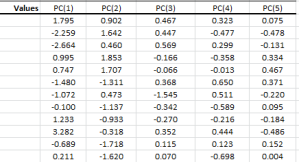
In the PC values table, we calculate the transformation output value for each dimension (i.e., component), so the 1st row corresponds to the 1st data point, and so on.
The variance of each column matches the value in the PCA statistics table. Using Excel, compute the biased version of the variance function (VARA).
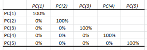
By definition, the values in the PCs are uncorrelated. To verify, we can calculate the correlation matrix:
Conclusion
In this tutorial, we converted a set of five correlated variables into five uncorrelated variables without any loss of information.
Furthermore, we examined the proportion (and cumulative proportion) of each component as a measure of variance captured by each component, and we found that the first three factors (components) account for 94.3% of the five variables’ variation, and the first four components account for 98%.
Tutorial Video - Principal Component Analysis (PCA)
What do we do now?
One of the applications of PCA is dimension reduction; as in, can we drop one or more components and yet retain the information in the original data set for modeling purposes?
In our second entry, we will look at the variation of each input variable captured by principal components (micro-level) and compute the fitted values using a reduced set of PCs.
We will cover this particular issue in a separate entry of our series.

